I found this lesson on color theory to be very fascinating, but also rather challenging. It seems it is easy to tell when a design is done well, but not always easy to understand why. Learning the tactics designers use to create successful designs was beneficial and helped me differentiate good color strategies from not so good ones. I can already tell that learning the correct usage of color is a difficult task and something that will take a good amount of practice. I'm sure I will be referencing this lesson often, especially in future illustration classes, where color is often just as important as content.
It was interesting to hear about Isaac Newton's development of the color theory. And see the correlation between this design lesson and lessons on Newton in my History of Natural Science class. I like when courses overlap and you can see the relationship between different fields of study. It allows me to see how cohesive things are in the real world.
Hopefully this lesson will help me make better color choices in my own artwork. I can already tell that I've been looking at printed media and everyday objects with a much more critical eye towards color.
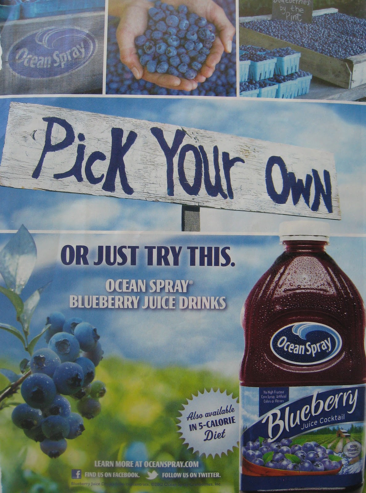
The following are six examples of successful color strategies.
 |
| Transition in Value |
This advertisement for Dove chocolate is an example of smart design. Using a value transition emphasizes the rich, smoothness of their product and gives the ad a subtle creamy look. And keeping the colors limited puts the focus on their product, not their packaging.
 Chroma Dominance This advertisement for nail polish really grabs your attention with their strong use of chroma dominance. The striking red is consistent throughout the design and effectively displays the color intensity of their product. I think the designers of this page were smart in limiting their color palette simply to one hue and one large focal point. Additional colors and objects might have made this had visually confusing. |
 |
| Contrasting Chroma |
 |
| Harmonious Hues |
 |
| Weakened Chroma & Weakened Contrast |
 |
| Key the Color |
No comments:
Post a Comment